


I love color; I really, really do. However, I've discovered over time (and over multiple disappointing paint jobs) that I personally am happier being surrounded by softer colors on my walls. That way, even if the wall color isn't actually a neutral by defintion, it still serves as a nice neutral canvas for the room.
It's important to note that by 'soft' I do not mean pale builder's beige or barely-there-almost-white colors. I have just learned the hard way (read: expensive way) that when I find a great color, I will be happier if I actually select the color on the sample chip that is one or two shades lighter. And apparently it's not just me, since I've read several articles or watched interviews with designers who say the same thing.
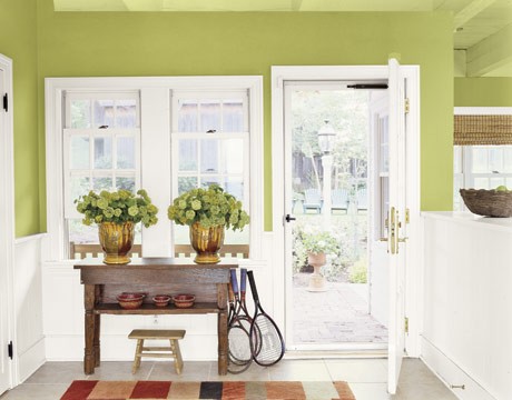
For example, when I painted my kitchen, this was my inspiration (green is my favorite color evaaaah!)
 (Photo: Country Living)
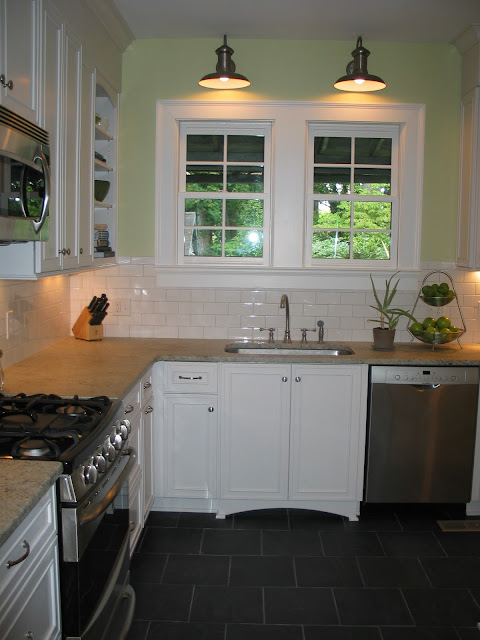
And here's how my kitchen turned out :

And guess what? I don't love my kitchen! It's TOO green for me. I am such a wuss.
When literally surrounded by a color it definitely feels more intense than it did on a little piece of paper. And while I still love the color, I've had a hard time being surrounded by it in my kitchen. I would love it above board and batten or another wainscoting treatment, or even in a kitchen that had a backsplash to break the paint color up.... but I don't have a backsplash (yet, peeps) in my kitchen and the color just feels too strong for me.
It's important to note that by 'soft' I do not mean pale builder's beige or barely-there-almost-white colors. I have just learned the hard way (read: expensive way) that when I find a great color, I will be happier if I actually select the color on the sample chip that is one or two shades lighter. And apparently it's not just me, since I've read several articles or watched interviews with designers who say the same thing.
For example, when I painted my kitchen, this was my inspiration (green is my favorite color evaaaah!)
And here's how my kitchen turned out :
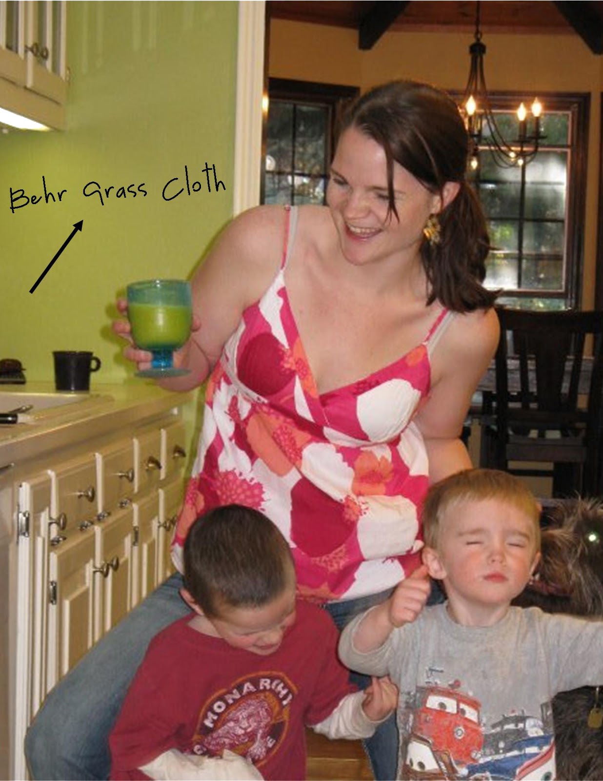
(sorry about the less-than-ideal family photo, remember my kitchen's bad lighting? This is the best photo, color-wise, that I have. And yes, we are ROCKING OUT to something.)
When literally surrounded by a color it definitely feels more intense than it did on a little piece of paper. And while I still love the color, I've had a hard time being surrounded by it in my kitchen. I would love it above board and batten or another wainscoting treatment, or even in a kitchen that had a backsplash to break the paint color up.... but I don't have a backsplash (yet, peeps) in my kitchen and the color just feels too strong for me.
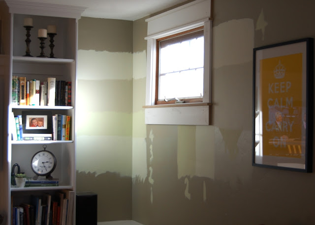
Soo... onto my living room, which feels a bit like a giant paint-by-numbers picture right now.
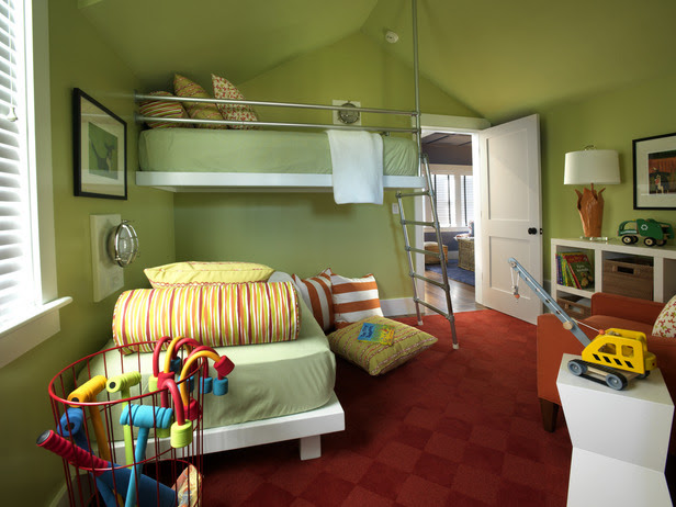
One of my favorite colors of green is Sherwin Williams' Hearts of Palm.
Here are a couple rooms with Hearts of Palm on the walls:
 (Photo: HGTV)
 (Photo: iVillage GardenWeb)
I almost picked Hearts of Palm for my kitchen, but now I know that it is most likely too intense for my soft color-lovin' self without some serious white woodwork to break it up. Lucky for me, I also love the next lighter color on the paint chip, Rice Paddy.

Here are some examples of Rice Paddy in rooms:

One of my favorite colors of green is Sherwin Williams' Hearts of Palm.
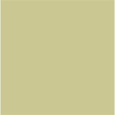


I almost picked Hearts of Palm for my kitchen, but now I know that it is most likely too intense for my soft color-lovin' self without some serious white woodwork to break it up. Lucky for me, I also love the next lighter color on the paint chip, Rice Paddy.

Here are some examples of Rice Paddy in rooms:

(Photo: decorpad)
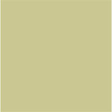
And here it is on my wall:
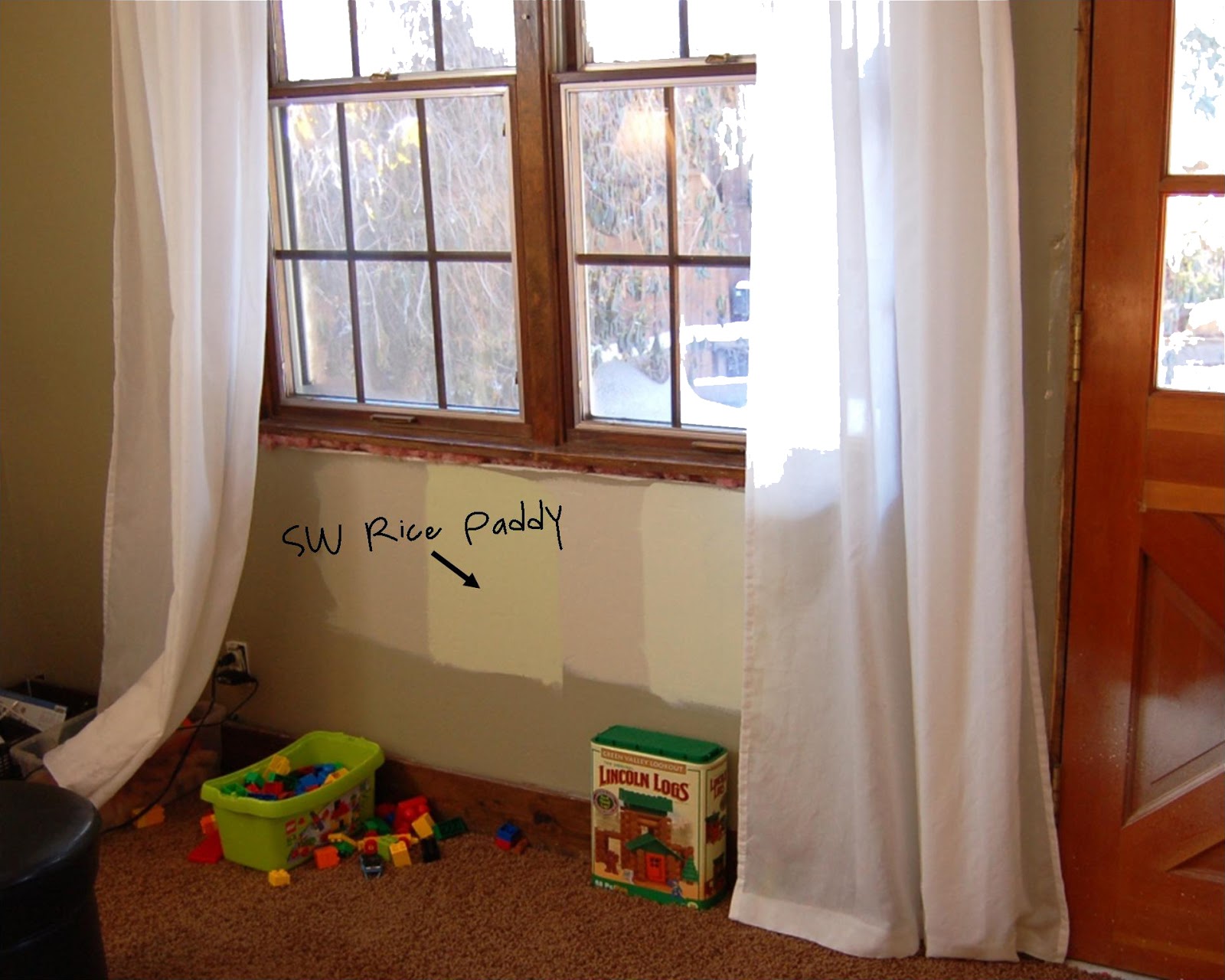
The only thing left for me to decide is whether I'm a big giant wuss because I'm leaning toward the softer Rice Paddy color -- in person is definitely has a presence, it is not an almost-white at all.
What are your paint color philosophies? I want to know!
Are you a lover of bold colors or do you like softer colors on your walls?
Are you a fan of neutrals or do you prefer to break out something colorful when it comes time to paint?


Great post! I am a fan of green. I have Vaspars Basil on my kitchen walls but just decided on Sliced Cucumber by Behr for the redo. Still green but pale with a hint of grey. Im excted.
ReplyDeleteThe paint has to make you excited.. lol not nervous and you seem exicted by Rice paddy.. go for it!
oh and I picked for an award and had to play it forward to one of my fave blogs - And you are one of them! I posted it today on my blog!
thanks!
~Tana
Thanks! I bet your kitchen is going to look great... you'll be blogging about it, right?? :)
ReplyDeleteAnd thanks for the award! I'll hop over to your blog and thank you there too.
I like, no L.O.V.E the Rice Paddy. It has a very warm, soothing feel to it.
ReplyDeleteI have Behr Martini Olive in my kitchen and love it! They don't have a paint card for it, I found it in one of the foldouts.
ReplyDeleteGo for teh Rice Paddy! Do you think it would look nice in a bedroom? While I was pregnant I painted 5 different shades of green over my headboard and HATED every single one- still do. right now my bedroom walls are still white with the exception of the rainbow of green above our bed, and I'm still looking for that perfect shade of green. As for the rest of our house our main area is Pratt and Lambert Sesame which is a neutral but has a green undertone- I wanted a neutral in the main living areas so I can change decor colors with the seasons. Our mudrooom is Behr French Gray which is a pretty blue/gray color.
ReplyDeleteI think the Grass Cloth is wonderful! but I can see where the Rice Paddy would be more liveable. Green is my favorite color too, and I've used it in guest bedrooms, but it really does need a lot of white to offset it. Plus its got so many different shades, it really is hard to pick! We did an aqua room once, and it took us six tries to get the shade right.
ReplyDeleteI totally DID go for the Rice Paddy, it's painted and I lurve it.
ReplyDeleteRebeca, I could see it in a bedroom but it really depends on what you're going for in there -- greens can be tough but I have a few faves if you'd like to chat ;) ALSO, our bedroom in our UT house is painted French Gray... our renters hate it! Oh well I always thought it looked cute ;)
Anne, I love aqua! I have plans up my sleeve for an aqua room. What shade did you finally settle on??
Def "Rice Paddy" with the color of you flooring, it will give a nice ambiance of green but not make it look dark in your living room. Great makeovers! I love the garden work in progress, that's right where I'm at right now too!
ReplyDeletei painted my kitchen hearts of palm! (my walls have an off white thick bead board half way up and thick wood trim and crown molding (original from 1950!). love the color and u are right! it is very bright and stimulating! its exactly what i wanted to brighten up our dining room/kitchen! (just painted interesting aqua by sw in hall bathroom and blonde on my ling narrow hall! love them and the way they work together! yay.
ReplyDeleteGreen is indeed a very wonderful color to use in our house's interiors. A lot of homeowners are surely inspired to use this shade in their own homes. Thanks for sharing.
ReplyDeleteI'm a few months off for this conversation but, after being inspired by the SW Dream Home 2013, I am going with SW Hearts of Palm in my kitchen and hallway leading to the kitchen. Right now my kitchen is painted SW connected Gray, very sophisticated gray with green undertones. It's safe, a little too sophisticated and yes, without the right colors to accent - it's dreary.
ReplyDeleteWe are not a bright family, but have decided to take a plunge and make our home feel like a vacation we would want to go on. I have used Hearts of Palm before in two small bedrooms of a previous home, at that time I didn't even think of it as being too bright. I can't even remember why I chose it or used it. Funny huh? After seeing it in the Dream Home, where in most of the images and video over intensify the green because of the camera lighting, I love how the dark orange dining table, the black light fixture and the gray and creamy kitchen cabinets looked so inviting.
I did the test in our home; painted one small kitchen wall Hearts of Palm - at first, because of all the dark Connected Gray - it did look very bright. But after putting my Pier 1 brown Rattan chair with a brick red seat cushion in front of it - we all gasped at just how beautiful Hearts of Palm brought our the colors in that chair. We started gathering our accessories and fabrics and holding them up in front - and my husband said that's it. I love that color! So here we go, on a Hearts of Palm ride. I am also painting my kitchen cabinets a gray and cream as in the Dream Home!!